More accessible Moodle content with styles

Article sections
It’s good to remember that accessible content is easy to use for everyone.
Use of styles
Always title your text. Also use subheadings to clarify the whole.
Styles make it easier to structure content. As an example of good headings and content structuring, the body of the model task.
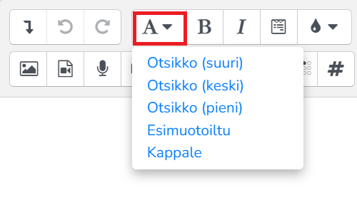
Take advantage of Moodle’s text editor styles to improve accessibility:
- There are three heading styles (see image): large (h3), medium (h4) and small (h5).
- Format the actual content text in the Paragraph style.
- You can use the pre-formatted style in points that are meant to be taken into account separately.

Added accessibility improvement buttons (March 23, 2021)
Checking accessibility in Moodle’s text editor
There are two tools for checking accessibility and ease of use.

- The ease of use check examines e.g. titles entries.
- The screen reader’s assistant examines the paragraph’s settings and the links and images in the text with description texts.
Captions for images (alt texts)
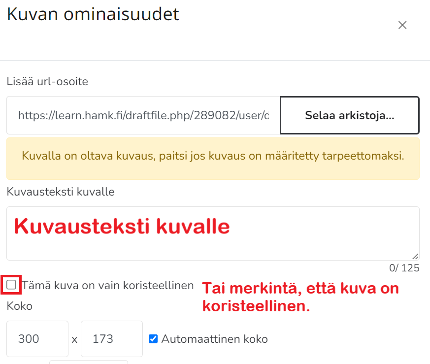
The description texts of the pictures significantly improve the readability of the content. If the image lacks an alt text, the screen reader may read, for example, the file name of the image.
Add descriptive text to the images.
If the content of the image appears in the text anyway or the image is only decorative, you can mark the image as decorative. In this case, the screen reader leaves the image unread.

Comprehensible content
- The language is clear, common language.
- The text is structured and easy to read.
- The most important thing can be found at the beginning.
- The content takes into account the perspective of the target group.
- The content is offered in different formats: in addition to text, e.g. video and infographics.
